-
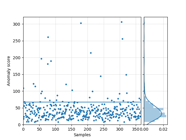
kenchi.plotting.plot_anomaly_score(anomaly_score, ax=None, bins='auto', figsize=None, filename=None, hist=True, kde=True, threshold=None, title=None, xlabel='Samples', xlim=None, ylabel='Anomaly score', ylim=None, **kwargs)[source]¶ Plot the anomaly score for each sample.
Parameters: - anomaly_score (array-like of shape (n_samples,)) – Anomaly score for each sample.
- ax (matplotlib Axes, default None) – Target axes instance.
- bins (int, str or array-like, default 'auto') – Number of hist bins.
- figsize (tuple, default None) – Tuple denoting figure size of the plot.
- filename (str, default None) – If provided, save the current figure.
- hist (bool, default True) – If True, plot a histogram of anomaly scores.
- kde (bool, default True) – If True, plot a gaussian kernel density estimate.
- threshold (float, default None) – Threshold.
- title (string, default None) – Axes title. To disable, pass None.
- xlabel (string, default 'Samples') – X axis title label. To disable, pass None.
- xlim (tuple, default None) – Tuple passed to
ax.xlim. - ylabel (string, default 'Anomaly score') – Y axis title label. To disable, pass None.
- ylim (tuple, default None) – Tuple passed to
ax.ylim. - **kwargs (dict) – Other keywords passed to
ax.plot.
Returns: ax – Axes on which the plot was drawn.
Return type: matplotlib Axes
Examples
>>> import matplotlib.pyplot as plt
>>> from kenchi.datasets import load_wdbc
>>> from kenchi.outlier_detection import MiniBatchKMeans
>>> from kenchi.plotting import plot_anomaly_score
>>> X, _ = load_wdbc(random_state=0, return_X_y=True)
>>> det = MiniBatchKMeans(random_state=0).fit(X)
>>> anomaly_score = det.anomaly_score(X, normalize=True)
>>> plot_anomaly_score(
...     anomaly_score, threshold=det.threshold_, linestyle='', marker='.'
... )
<matplotlib.axes._subplots.AxesSubplot object at 0x...>
>>> plt.show()
-
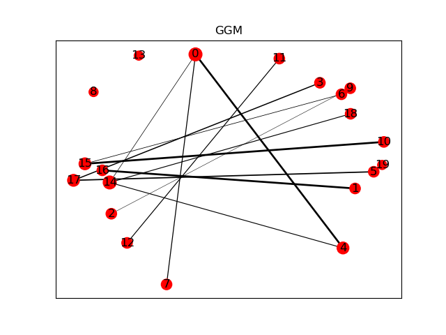
kenchi.plotting.plot_graphical_model(G, ax=None, figsize=None, filename=None, random_state=None, title='GGM', **kwargs)[source]¶ Plot the Gaussian Graphical Model (GGM).
Parameters: - G (networkx Graph) – GGM.
- ax (matplotlib Axes, default None) – Target axes instance.
- figsize (tuple, default None) – Tuple denoting figure size of the plot.
- filename (str, default None) – If provided, save the current figure.
- random_state (int, RandomState instance, default None) – Seed of the pseudo random number generator.
- title (string, default 'GGM') – Axes title. To disable, pass None.
- **kwargs (dict) – Other keywords passed to
nx.draw_networkx.
Returns: ax – Axes on which the plot was drawn.
Return type: matplotlib Axes
Examples
>>> import matplotlib.pyplot as plt
>>> import networkx as nx
>>> from kenchi.plotting import plot_graphical_model
>>> from sklearn.datasets import make_sparse_spd_matrix
>>> A = make_sparse_spd_matrix(dim=20, norm_diag=True, random_state=0)
>>> G = nx.from_numpy_matrix(A)
>>> plot_graphical_model(G, random_state=0)
<matplotlib.axes._subplots.AxesSubplot object at 0x...>
>>> plt.show()
-
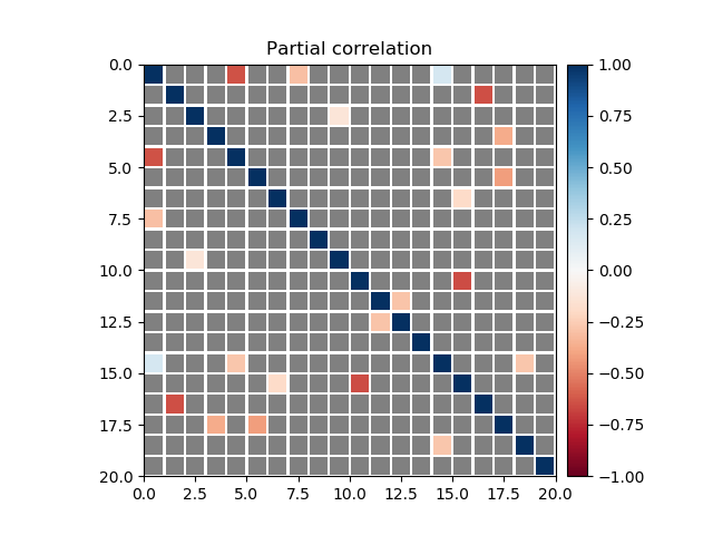
kenchi.plotting.plot_partial_corrcoef(partial_corrcoef, ax=None, cbar=True, figsize=None, filename=None, title='Partial correlation', **kwargs)[source]¶ Plot the partial correlation coefficient matrix.
Parameters: - partial_corrcoef (array-like of shape (n_features, n_features)) – Partial correlation coefficient matrix.
- ax (matplotlib Axes, default None) – Target axes instance.
- cbar (bool, default True.) – If True, draw a colorbar.
- figsize (tuple, default None) – Tuple denoting figure size of the plot.
- filename (str, default None) – If provided, save the current figure.
- title (string, default 'Partial correlation') – Axes title. To disable, pass None.
- **kwargs (dict) – Other keywords passed to
ax.pcolormesh.
Returns: ax – Axes on which the plot was drawn.
Return type: matplotlib Axes
Examples
>>> import matplotlib.pyplot as plt
>>> from kenchi.plotting import plot_partial_corrcoef
>>> from sklearn.datasets import make_sparse_spd_matrix
>>> A = make_sparse_spd_matrix(dim=20, norm_diag=True, random_state=0)
>>> plot_partial_corrcoef(A)
<matplotlib.axes._subplots.AxesSubplot object at 0x...>
>>> plt.show()
-
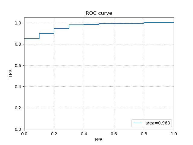
kenchi.plotting.plot_roc_curve(y_true, y_score, ax=None, figsize=None, filename=None, title='ROC curve', xlabel='FPR', ylabel='TPR', **kwargs)[source]¶ Plot the Receiver Operating Characteristic (ROC) curve.
Parameters: - y_true (array-like of shape (n_samples,)) – True Labels.
- y_score (array-like of shape (n_samples,)) – Target scores.
- ax (matplotlib Axes, default None) – Target axes instance.
- figsize (tuple, default None) – Tuple denoting figure size of the plot.
- filename (str, default None) – If provided, save the current figure.
- title (string, default 'ROC curve') – Axes title. To disable, pass None.
- xlabel (string, default 'FPR') – X axis title label. To disable, pass None.
- ylabel (string, default 'TPR') – Y axis title label. To disable, pass None.
- **kwargs (dict) – Other keywords passed to
ax.plot.
Returns: ax – Axes on which the plot was drawn.
Return type: matplotlib Axes
Examples
>>> import matplotlib.pyplot as plt
>>> from kenchi.datasets import load_wdbc
>>> from kenchi.outlier_detection import MiniBatchKMeans
>>> from kenchi.plotting import plot_roc_curve
>>> X, y = load_wdbc(random_state=0, return_X_y=True)
>>> det = MiniBatchKMeans(random_state=0).fit(X)
>>> score_samples = det.score_samples(X)
>>> plot_roc_curve(y, score_samples)
<matplotlib.axes._subplots.AxesSubplot object at 0x...>
>>> plt.show()